Howdy, Stranger!
It looks like you're new here. If you want to get involved, click one of these buttons!
Red fortresses vs. Color blindness
About 10% of men and 0.5% of women have a color vision deficiency.
Red deficiency is the most common (with the green).
I'm not completely red-blind but I'm one of them.
At the time when there were a normal/hardcore server + a capture-the-flags server, the main reason I wasn't playing on the capture-the-flags one is that when I was blue or purple, I couldn't distinguish my allies from my blue or purple enemies.
Now, this problem is no longer (since there is only red/blue).
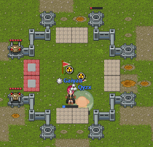
But when I'm blue, I can hardly see the transparent barriers of the red fortresses (with 2 flags, 2 chests + 2 items in it).
For me, this transparent red is hard like seeing a 98% ligthgray (#F9F9F9) on a white (#FFFFFF) background.
When I'm blocked, I realize, but that's not funny.
And sometimes I start to weaken torrets without noticing there is a missing barrier on another side of the fortress.
The state of the torrets can't help as much as changing something with the transparent red barriers.
When I try to break a torret, I have look at the torret to see its state, but when I want to go though the place of the barriers, it's not easy to check quickly the state of the 2 torrets.
In fact it's not easy as well to see their state.
It's easier than the transparent red barriers but not as much as it would with a white/black damage bar.
For me, their state is "easy" to see about like a 28% darkgray (#484848) vs. the current 16% darkgray (#292929).
Some easy solutions could be to:
- choose another color for the red team: Yellow is the best choice because the yellow-blue confusion is extremely rare (the rarest of all variants of color blindness).
- use already existing surfaces: red/blue surfaces while filtering the players, and uncolored when not filtering.
 But it would change their meaning, confusing.


Comments
But that's more tiles.
Horizontal arrows for the vertical barriers of the fortress and vertical arrows for the horizontal barriers.
When I'm blue or purple, I don't know who are my blue or purple allies and who are my purple or blue enemies, and which places are blue or purple.
What a bad color choice... I think red/blue/yellow/white would be better.
And, this is another subject (already posted) but 4 teams is often too many.
I was sharing that because I have personal experience with someone who suffers from the same thing you do. However I am now changing what I said since it appears you have a hard time with interpreting context so I wish to never have to deal with that from you again.